InfoVids: Reimagining the Viewer Experience with Alternative Visualization-Presenter Relationships
Ji Won Chung, Tongyu Zhou, Ivy Chen, Kevin Hsu, Ryan A. Rossi, Alexa Siu, Shunan Guo, Franck Dernoncourt, James Tompkin, Jeff Huang
2025-05-07
Summary
This paper talks about a new way of showing data called InfoVids, which changes how presenters and visualizations interact during presentations. Instead of keeping the presenter and the visuals separate, InfoVids blend them together to make the experience more about the person presenting and less about just staring at charts or slides.
What's the problem?
The main problem is that traditional presentations put the presenter and the data visuals in different spaces, like having a person talk in front of a screen with slides behind them. This setup makes people focus mostly on the visuals and not on the presenter, and it can also make it hard for viewers to pay attention to both at the same time.
What's the solution?
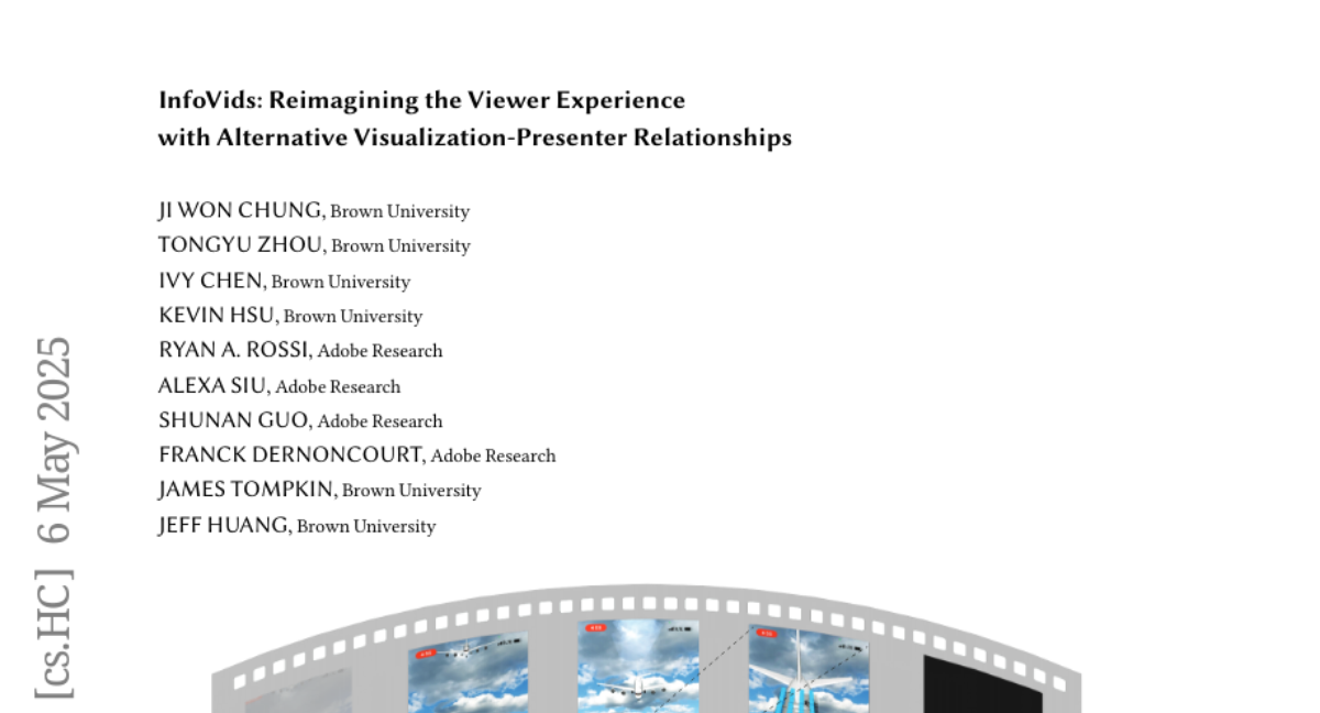
To solve this, the researchers created InfoVids, which are videos inspired by infographics where the presenter and the visuals are more connected and balanced. They experimented with different layouts, forms, and ways the presenter could interact with the visuals. Then, they compared InfoVids to regular 2D slide presentations using several measurements and feedback from participants to see how the viewer experience changed.
Why it matters?
This matters because InfoVids help people pay better attention, make the presenter more important in the story, and create a more engaging and interactive way to present data. By changing the relationship between the presenter and the visuals, InfoVids could make learning from presentations easier and more enjoyable for everyone.
Abstract
Traditional data presentations typically separate the presenter and visualization into two separate spaces--the 3D world and a 2D screen--enforcing visualization-centric stories. To create a more human-centric viewing experience, we establish a more equitable relationship between the visualization and the presenter through our InfoVids. These infographics-inspired informational videos are crafted to redefine relationships between the presenter and visualizations. As we design InfoVids, we explore how the use of layout, form, and interactions affects the viewer experience. We compare InfoVids against their baseline 2D `slides' equivalents across 9 metrics with 30 participants and provide practical, long-term insights from an autobiographical perspective. Our mixed methods analyses reveal that this paradigm reduced viewer attention splitting, shifted the focus from the visualization to the presenter, and led to more interactive, natural, and engaging full-body data performances for viewers. Ultimately, InfoVids helped viewers re-imagine traditional dynamics between the presenter and visualizations.